Color is one of the most powerful tools in a stylist's arsenal. Far beyond aesthetic appeal, the colors we wear communicate subtle messages to those around us, influence how others perceive us, and even affect our own mood and behavior. As a professional stylist specializing in color theory, I've witnessed firsthand how strategic color choices can transform not just appearances, but experiences. Let's explore the fascinating world of color psychology in fashion and how you can harness it to express and enhance your personal style.
The Science Behind Color Psychology
Color psychology isn't just fashion theory—it's rooted in scientific research about how different wavelengths of light affect human physiology and neurological responses. Our brains process color information and trigger hormonal changes that can influence everything from blood pressure and pulse rate to mood and energy levels.
Colors are processed by our visual system and then interpreted by the brain's limbic system—the part responsible for emotions and memory. This explains why color associations can be both universal (based on shared human experiences like seeing a blue sky) and cultural (based on specific meanings assigned within societies).
Did You Know?
Studies have shown that people make subconscious judgments about a person, environment, or product within 90 seconds of initial viewing—and between 62% and 90% of that assessment is based on color alone.
The Emotional Spectrum: What Colors Communicate
Each color carries psychological associations that can be strategically employed in your wardrobe. Here's a comprehensive guide to major colors and their emotional effects:
Red: Power, Passion, and Energy
Red increases heart rate and stimulates adrenaline. In fashion, it communicates confidence, assertiveness, and passion. It's an attention-grabbing color that makes the wearer appear more dynamic and commanding.
When to wear it: Job interviews where you want to appear decisive and energetic, romantic dates, situations where you need to make an impact or demonstrate authority.
Style tip: Use red strategically—a full red outfit can be overwhelming, while red accessories or a red blouse under a neutral suit can add just the right amount of power and passion.
Blue: Trust, Calm, and Competence
Blue has a physiologically calming effect, lowering blood pressure and heart rate. It communicates reliability, stability, and thoughtfulness. Not coincidentally, it's the most universally preferred color across cultures.
When to wear it: Job interviews in corporate environments, first meetings with clients, situations where building trust is essential.
Style tip: Navy is particularly effective for professional settings, while lighter blues work well for creating approachable, friendly impressions.
Yellow: Optimism, Creativity, and Attention
Yellow is the most visible color to the human eye. It stimulates mental activity and generates feelings of optimism and creativity. However, research shows it can also create anxiety if overused.
When to wear it: Creative presentations, brainstorming sessions, social gatherings where you want to appear approachable and cheerful.
Style tip: Yellow can be challenging for many skin tones, so consider your specific undertones or use yellow as an accent color rather than a dominant one.
Green: Balance, Growth, and Harmony
Green occupies the center of the visible spectrum and requires no adjustment by the eye, making it inherently restful. It evokes nature, balance, and reassurance.
When to wear it: Situations requiring diplomacy, mediation, or healing; environments where you want to promote equilibrium and growth.
Style tip: Emerald and deeper forest greens convey sophistication, while lighter sage and mint tones create a more youthful, fresh appearance.
Purple: Luxury, Creativity, and Wisdom
Historically associated with royalty due to the rarity of purple dye, purple continues to communicate luxury, dignity, and creative thinking. It combines the energy of red with the stability of blue.
When to wear it: Creative industry events, situations where you want to convey uniqueness or unconventional thinking, luxury settings.
Style tip: Deep purples like plum or aubergine are more sophisticated and powerful, while lavender and lilac express gentleness and femininity.
Black: Sophistication, Authority, and Mystery
Technically the absence of color, black absorbs all light. It creates an impression of sophistication, authority, and sleekness. It's also slimming by reducing the perception of shadows on the body.
When to wear it: Formal events, professional settings where authority is important, situations where you want to appear sophisticated or mysterious.
Style tip: All-black can appear severe; consider introducing texture or subtle color accents to add dimension and approachability.
White: Purity, Simplicity, and Clarity
White reflects all light and communicates purity, simplicity, and new beginnings. It creates an impression of cleanliness and precision.
When to wear it: Situations where clarity of thought and freshness are advantageous, minimalist environments, summer events.
Style tip: Find the right white for your skin tone—cooler whites for cooler undertones, warmer creams and ivories for warmer undertones.
Color Harmonies: Creating Balanced Expressions
Beyond individual colors, the way colors work together creates additional psychological effects. Understanding color harmonies can help you create intentional moods through your outfits:
Monochromatic
Using variations of a single color creates a sophisticated, cohesive look that appears intentional and polished. It's calming to the eye and creates a lengthening effect visually.
Emotional effect: Communicates thoughtfulness, cohesion, and understated elegance.
Complementary
Colors opposite on the color wheel (blue/orange, purple/yellow, red/green) create high visual contrast and energy. This combination appears dynamic and confident.
Emotional effect: Creates excitement, demonstrates confidence and bold thinking.
Analogous
Colors adjacent on the color wheel (blue/green/teal or red/orange/yellow) work harmoniously together, creating a sense of cohesion with more interest than monochromatic schemes.
Emotional effect: Communicates harmony, thoughtful coordination, and creative balance.
Personal Color Analysis: Finding Your Psychological Home
While understanding color psychology is universally valuable, the most effective color choices are those that align with your natural coloring. Personal color analysis identifies the palette that harmonizes with your specific skin tone, hair color, and eye color.
When you wear colors within your natural palette, you appear more vibrant, healthy, and authentic. This natural alignment creates psychological congruence that enhances the communication power of your color choices.
Stylist Tip: Quick Personal Color Test
Hold silver and gold fabric/jewelry near your face in natural light. If silver appears more harmonious, you likely have cool undertones. If gold looks better, you probably have warm undertones. This fundamental distinction can guide your color choices.
Strategic Color Application: When and Where
How and where you apply color on your body also affects its psychological impact:
Color Near Your Face
Colors worn near your face have the strongest impact on how your facial features are perceived and will most significantly influence how others perceive you emotionally.
Strategic application: Wear power colors (red, strong blue) in tops, scarves, or necklaces when you want to communicate authority or make important points.
Color in Larger Blocks
Larger blocks of color (pants, skirts, dresses) create stronger emotional statements and can significantly affect your own mood throughout the day.
Strategic application: Choose calm, focused colors like navy or forest green for bottoms on days requiring concentration and stability.
Color in Accessories
Accessories provide opportunities to introduce psychologically powerful colors in smaller doses, creating accent effects without overwhelming.
Strategic application: Use accessories in energetic colors like yellow or orange when you want to appear approachable but maintain overall professionalism.
Cultural Considerations: Beyond Universal Responses
While many color associations are rooted in shared human experiences, cultural differences significantly influence color interpretation. When dressing for global or cross-cultural environments, consider these variations:
- White: Represents purity and weddings in Western cultures but is associated with mourning and funerals in many Eastern cultures.
- Red: Symbolizes good fortune and celebration in Chinese culture, passion in Western cultures, and mourning in parts of South Africa.
- Purple: Associated with royalty in Western traditions but with death and mourning in some Latin American cultures.
Being aware of these cultural differences demonstrates cultural intelligence and sensitivity when working or socializing internationally.
Practical Applications: Dressing with Intention
Here are practical scenarios where strategic color choices can significantly impact outcomes:
Professional Settings
- Job Interviews: Navy blue communicates competence and reliability; add a touch of red (tie, scarf, subtle accessory) to demonstrate energy and confidence.
- Presentations: Wear a color that contrasts with the background environment to stand out and command attention.
- Negotiations: Soft blue suggests trustworthiness, while touches of purple communicate value and worth.
Social Settings
- First Dates: Red stimulates excitement and attraction; blue creates comfort and encourages open communication.
- Networking Events: Approachable colors like teal or rich purple make you memorable while maintaining professionalism.
- Family Gatherings: Warm colors like terracotta, amber, or soft yellow communicate approachability and nurturing energy.
Personal Wellbeing
- Low Energy Days: Wear yellow or orange to naturally stimulate energy and optimism.
- Anxious Days: Choose blues and greens to create a calming effect on your nervous system.
- Need for Focus: Navy, dark purple, or forest green support concentration and mental clarity.
Conclusion: The Mindful Color Palette
Color is not merely decorative—it's a powerful communication tool that affects both how others perceive you and how you experience your own emotions and energy. By approaching color choices with psychological awareness, you transform your wardrobe into a strategic resource for expressing identity, influencing interactions, and supporting your personal wellbeing.
The most sophisticated approach to color psychology isn't about manipulating others' perceptions, but about creating authentic alignment between your inner state, your intentions, and your visual presentation. When these elements work in harmony, color becomes not just something you wear, but something you embody—a living expression of your unique presence in the world.
You May Also Like

Seasonal Wardrobe Transitions: Expert Tips
Learn how to seamlessly transition your wardrobe between seasons with these professional stylist recommendations.
Read More
Sustainable Fashion Choices That Don't Compromise Style
Explore eco-friendly fashion options that are both stylish and responsible choices for the conscious consumer.
Read More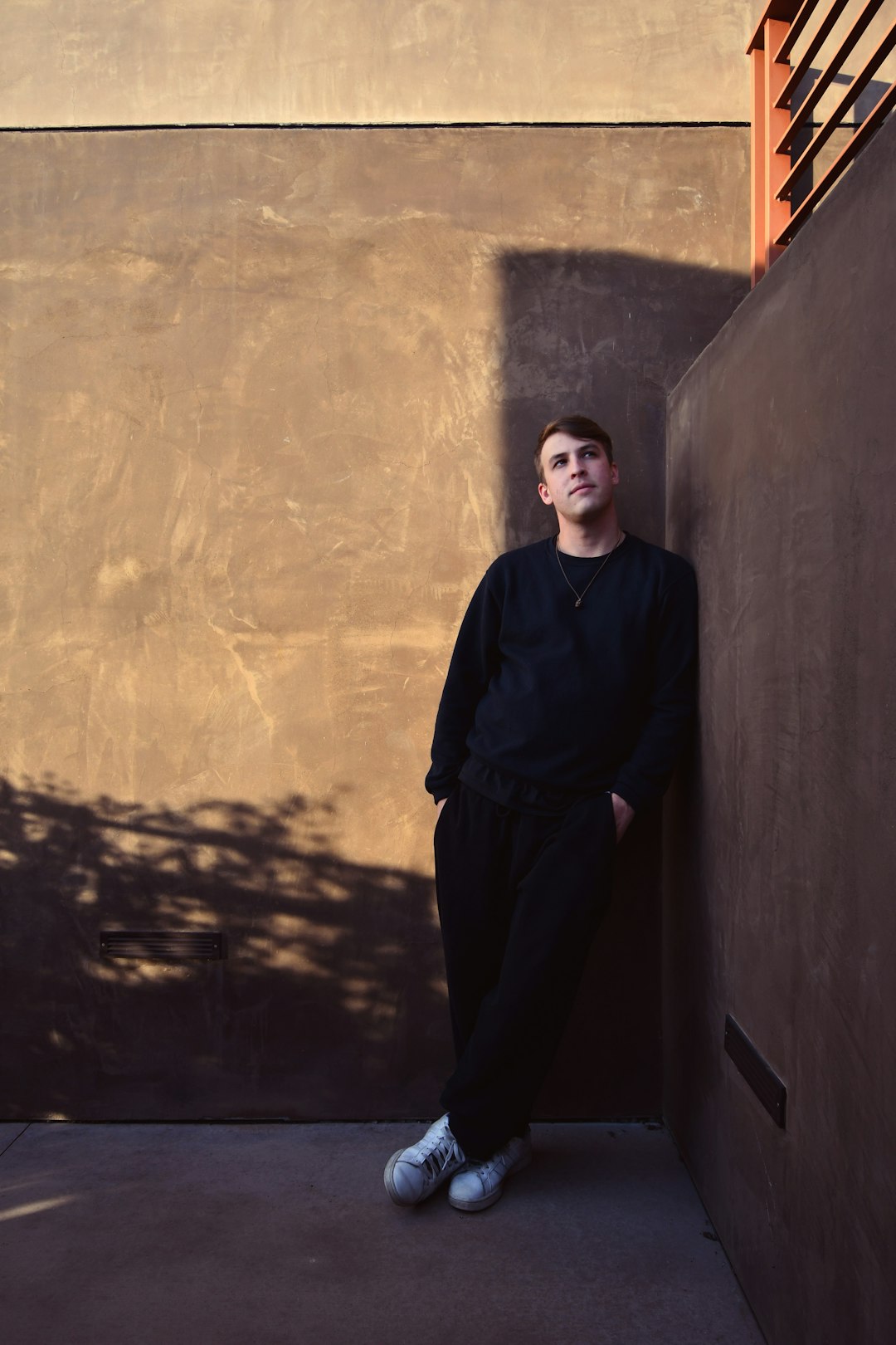
Accessorizing Fundamentals: Elevate Any Outfit
Master the art of accessorizing with professional guidelines on selecting and combining accessories.
Read More
Comments
Leave a Comment
Jessica Williams
May 10, 2024This article is eye-opening! I've always intuitively gravitated toward blues and greens but never understood the psychological reasoning. The section on strategic color application is particularly helpful - I have an important presentation next week and will definitely be incorporating some of these tips. Thank you for such a comprehensive guide!
Robert Jordan
May 9, 2024As someone who works in corporate environments but has always felt drawn to more creative expression, this article gave me practical ways to incorporate color psychology while maintaining professionalism. I especially appreciated the cultural considerations section - important context for my international meetings. Would love to see a follow-up article about seasonal color variations!